CD PUB is getting a makeover. And it’s reaffirming its positioning. With the launch of its brand new website, the Luxembourg agency, specializing in sales activation since 2002, is showcasing its expertise while clarifying its offering for professionals seeking tangible results.
A website redesigned from the ground up, focused on efficiency, clarity, and demonstration by example. A project that’s part of a broader vision: making digital a real sales lever, without ever losing sight of its roots in the field.
A showcase site redesigned to perform
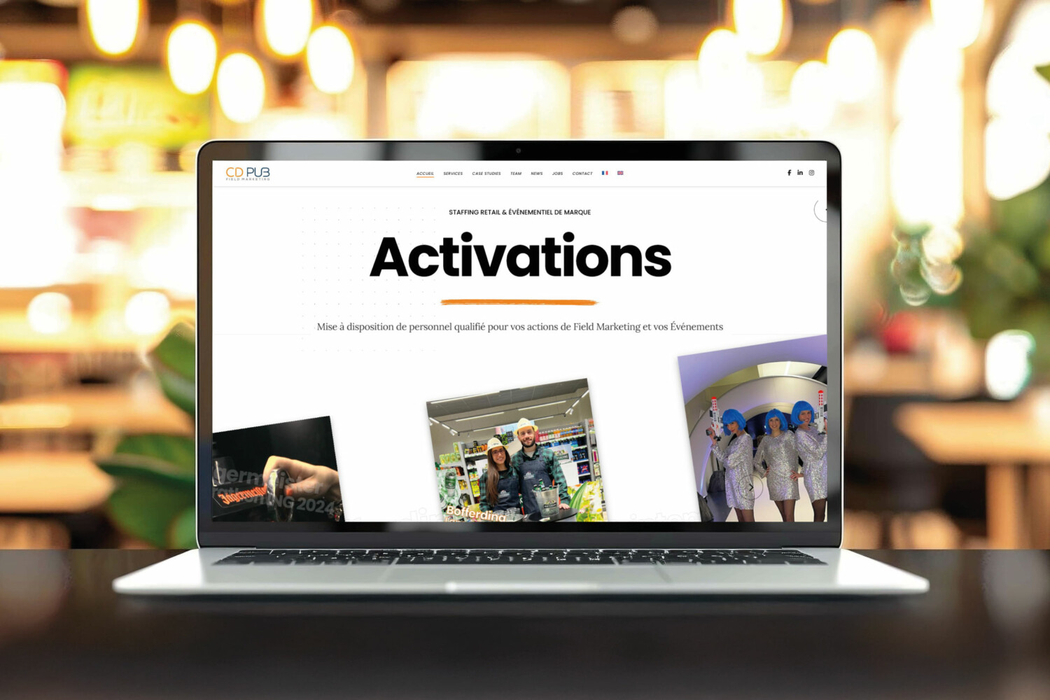
More than just a facelift, www.cdpub.lu embodies a renewed ambition. Clearer, faster, and more user-friendly, it was designed to offer a seamless , conversion-oriented user experience .
Simplified navigation, direct reading of the offer, detailed case studies, express contact… everything is done so that visitors, often marketing or sales decision-makers, immediately find what they are looking for .
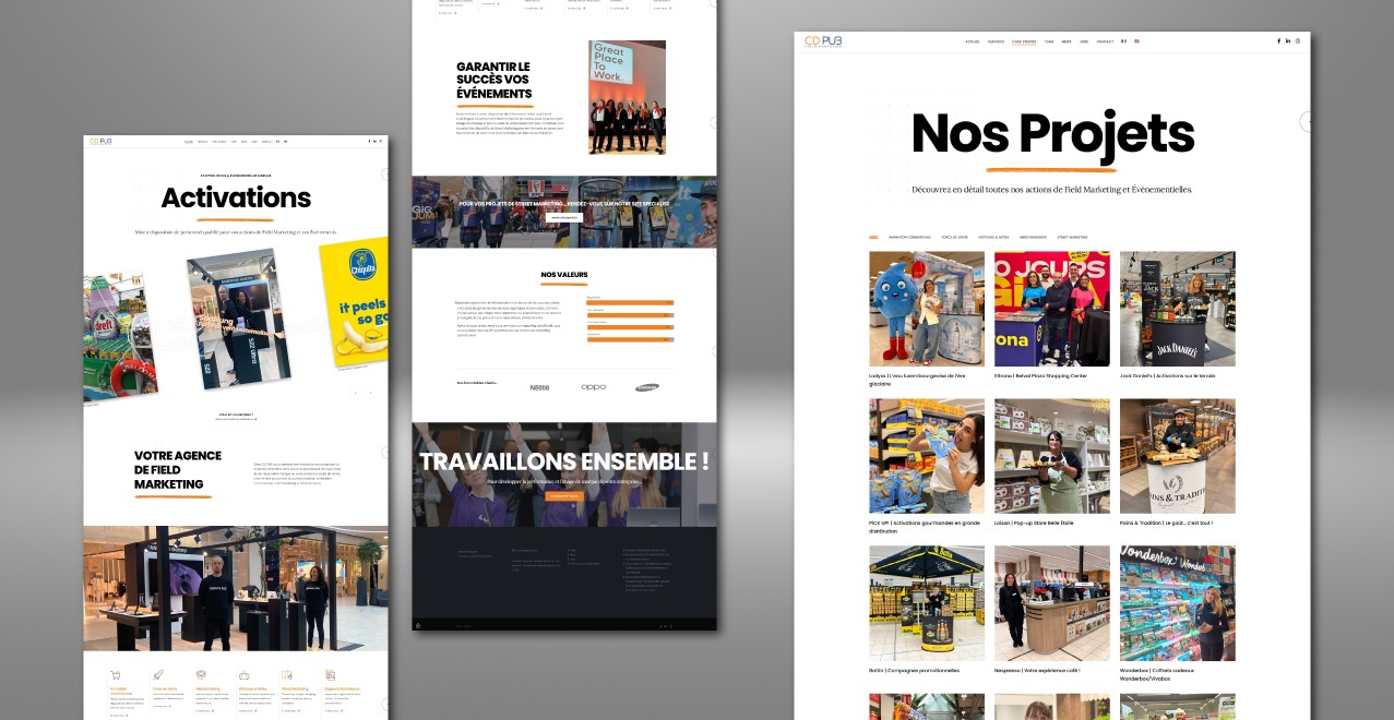
A site structured around three pillars :
- Our expertise : sales promotion, hostesses, merchandising, additional sales force, etc.
- Our achievements : concrete, illustrated and detailed cases.
- Our approach : rigor, advice, efficiency.
Proof by example
CD PUB makes a bold choice: to show, rather than promise. Each service becomes a documented client case study : context, problem, proposed solution, results achieved. No waffle, no blah blah. This transparency reassures, inspires, and highlights the agency’s field expertise.
It’s also a way of illustrating a strong promise: at CD PUB, it’s the field that speaks .
A mirror strategy between CD PUB and URBAN PUB
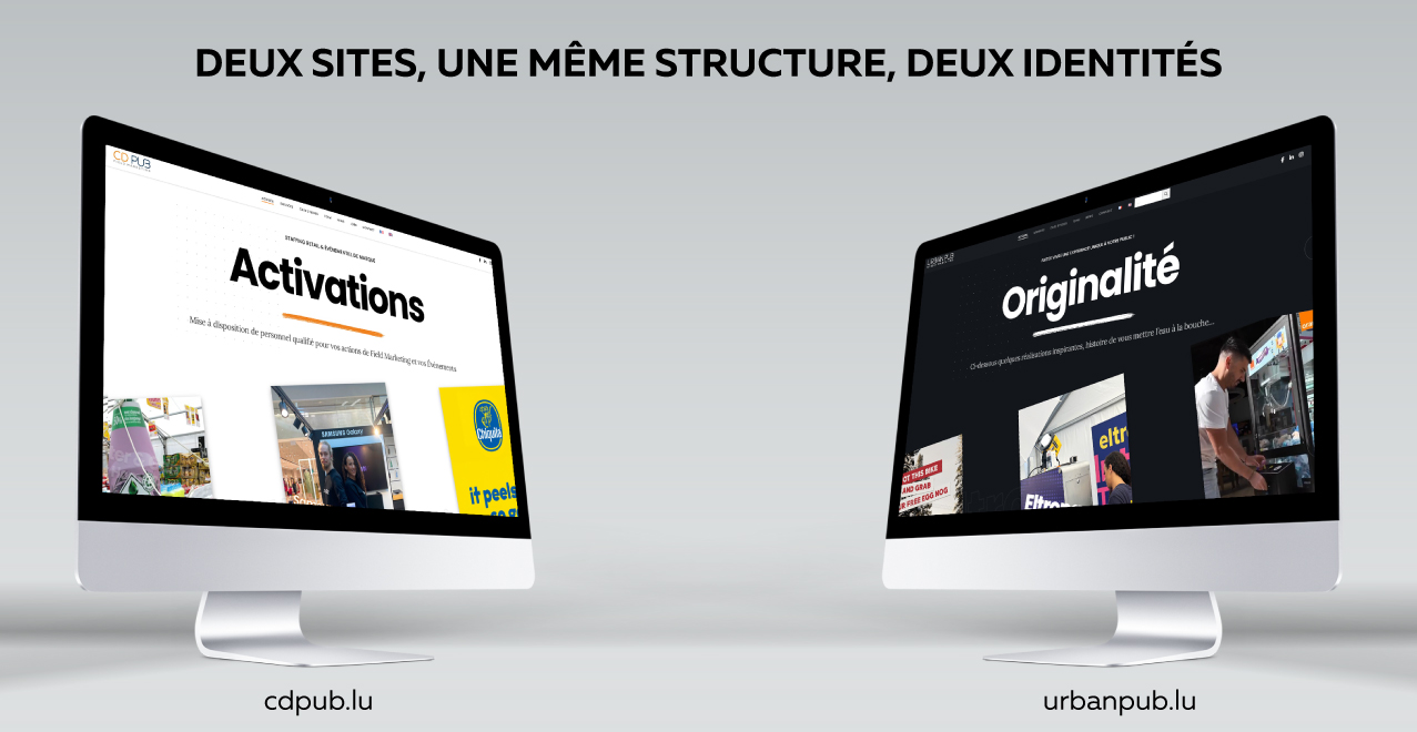
The real uniqueness of this redesign? Its connection with a second site ( its little brother ), www.urbanpub.lu , entirely dedicated to street marketing. The two platforms share an identical technical structure, but adopt radically opposed visual identities. A perfectly assumed mirror strategy .
- URBAN PUB is aimed at brands looking for boldness, with a dark, urban and striking graphic universe.
- CD PUB , for its part, focuses on a bright and refined design, a symbol of reliability, rigor and readability.
This graphic contrast is not a stylistic effect: it reflects two complementary positions , designed to meet different expectations. URBAN PUB captures, provokes, challenges . CD PUB reassures, structures, and transforms… A strategic coherence that highlights the duality of the offer, without blurring the message.
A showcase designed for professionals
By choosing to focus on demonstration and readability, CD PUB addresses its core target audience directly: marketing managers, category managers, agencies, sales departments.
The message is clear: no abstract promises here. CD PUB offers concrete, measurable solutions that can be quickly activated. The site thus becomes a decision-making tool , but also a commercial entry point , designed to trigger initial contact.
A clear ambition for 2025
With this new site, CD PUB affirms its vision: to become the strategic partner of reference for all brands wishing to effectively activate their field presence, in Luxembourg and in the Greater Region.
"This site reflects who we are: a straightforward, hands-on, results-oriented agency. We wanted to create a simple, no-nonsense experience to let what really matters speak for itself: our ability to generate impact.
(Lucas Amodeo – Co-manager of CD PUB)"